Aku Indonesia
Publication, Event
The World Bank is a global financial institution that works to fight poverty and promote shared prosperity worldwide through sustainable solutions. Our maiden project was to design a public launch event that accommodated the dialog between the institution and key GOI (Government of Indonesia) counterparts, including naming, graphic identity and collaterals.
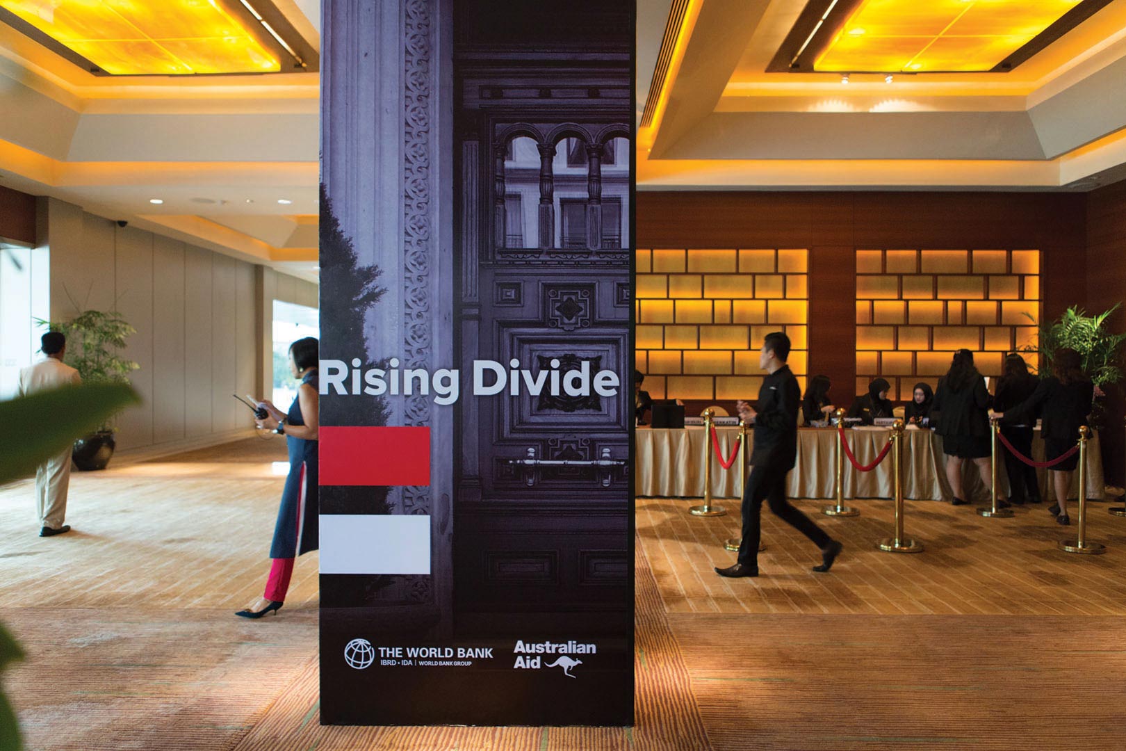
The event highlighted Indonesia as an increasingly divided country and what could be done to prevent the country from becoming even more. The name AKU INDONESIA was chosen for their constitution that underlined the rising inequality in Indonesia. The name was an acronym for “Akhiri Ketimpangan Untuk Indonesia”, meaning to end the discrepancy in Indonesia.
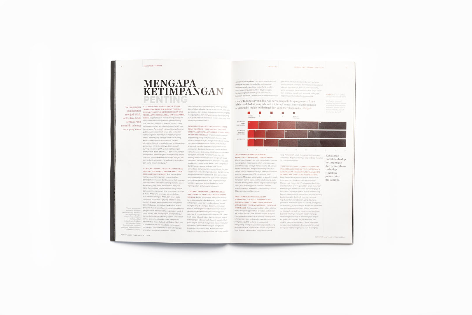
The identity masterfully mixes sans serif and italic serif type in a way that they work cohesively together as a unit. Sporting red and white – colours of Indonesian national flag, the logotype embodies the entity that makes an Indonesian regardless the social differences. Additionally, the equality sign (=) that impersonated the flag was used as visual language from which all collaterals of the event were realised
2016
The World Bank


