M Ten
Naming, Branding
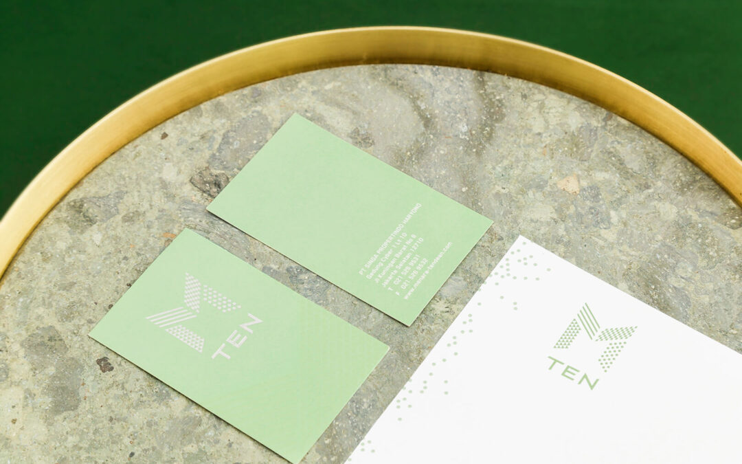
Driven by the emergence of digital era and changing work styles, M Ten positions itself as a workspace of future where efficiency and comfort are progressively intertwined. It was first conceived as a place to meet, work and lounge which appeals to the tech-based companies and millennial generations. Integrating office tower and retail space, the property benefits from its prime location in the same compound of Cyber Tower where the national interconnection point for Internet Service Providers is based.
The design of M Ten, therefore, should reflect its surroundings: contemporary, dynamic and audacious. The identity is a basic monogram of initial M, using patterns of dot, lines, diamond and triangles to make it feel more edgy and modern. The graphic pattern was a depiction of various components found in technology, such as fibre optic, cable, circuit and LED. Finished in metallic silver, the logo is a straightforward yet bold approach that captures the spirit of M Ten.
2015 – 2017
PT Singa Propertindo Haryono


")